Project Details
Role
Product Designer
Tools
Figma
Magic Patterns
Replit
Maze
Type
0 to 1 Product
Duration
18 months
Overview
Subscription plans lets restaurants and retailers on Toast sell recurring plans, like wine clubs and coffee subscriptions, and get paid automatically. I designed it from 0 to 1 as part of Toast's new Memberships product, and owned it from the first concept through launch and beyond.
Problem
Operators who wanted a wine club or coffee subscription had to use a separate tool, spreadsheets, or a different POS altogether. Even then, staff couldn’t tell who was a member, so perks were missed. When members don’t get what they pay for, they don’t renew, and operators lose recurring revenue.
Solution
An end-to-end subscription product: self-serve setup for operators, online sign-up and checkout for guests, and subscription management for both, all built on flexible recurring billing and payments.
My role
I owned the product from first concept to launch and beyond.
- Designed the full product: operator setup, guest sign-up and checkout, and the operator dashboard for managing plans and subscribers
- Set design direction and led reviews with a clear recommendation and trade-offs
- Ran a feedback loop on every project: early share, Loom walkthrough, design review, then a follow-up on where the design landed
- Built and ran the customer research loop after launch
- Kept the team’s decision record in a product and design strategy doc so the team stayed aligned on the why
- Designed vision prototypes used to make the case for the next phase
The design challenge
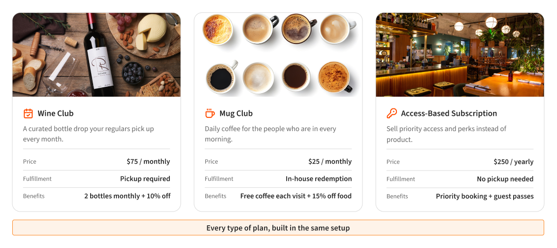
One product for every type of subscription.
A wine club needs a monthly pickup. A mug club redeems coffee in-house every visit. An access club sells perks with nothing to pick up. Under the hood, each one has its own rules for when to charge, how members get what they paid for, and how perks show up at the front of house. The challenge was keeping all of that out of the operator’s way, so setup still felt like a few simple questions.
The product
One product, four sides
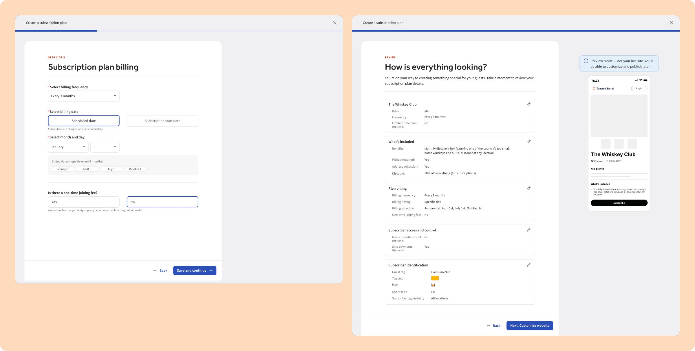
1. Operators build a plan in a guided onboarding wizard.
A five-step wizard walks operators through building their plan: what’s included, how often and on what date to charge, and any joining fee. They review it all next to a preview of the sign-up page, then move on to customizing their site.
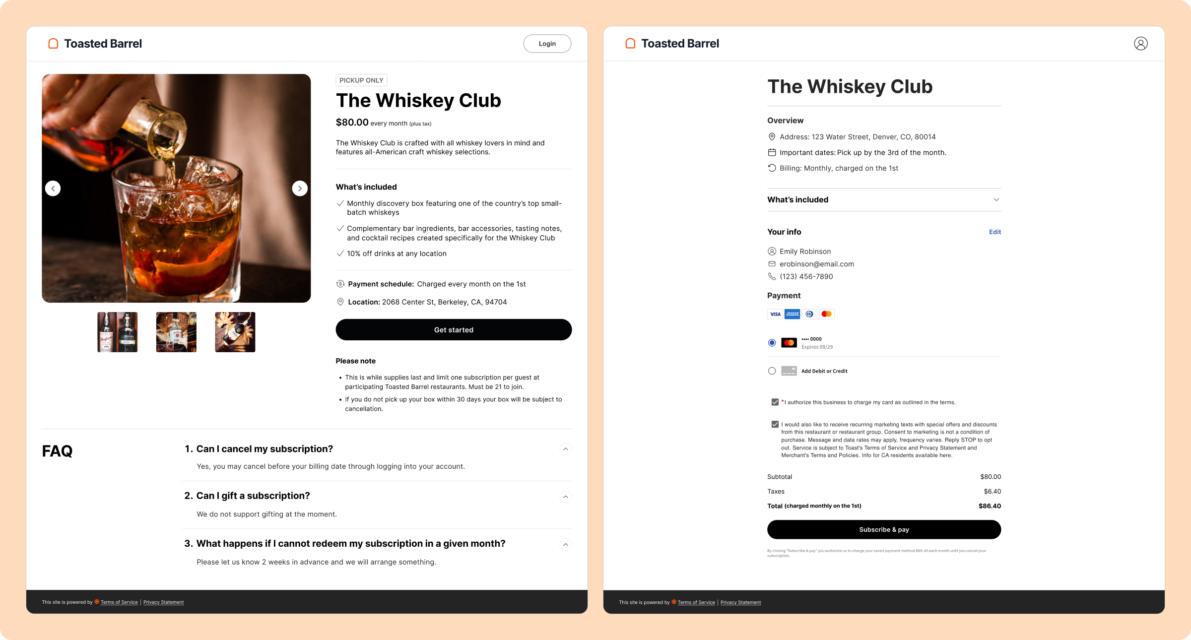
2. Guests sign up and check out on a branded landing page.
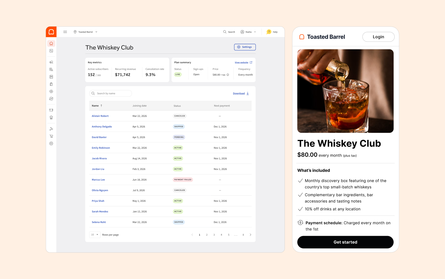
Guests land on a branded plan page that shows what’s included, when they’ll be charged and where to pick up. At checkout they confirm the details, save a card and agree to recurring charges.
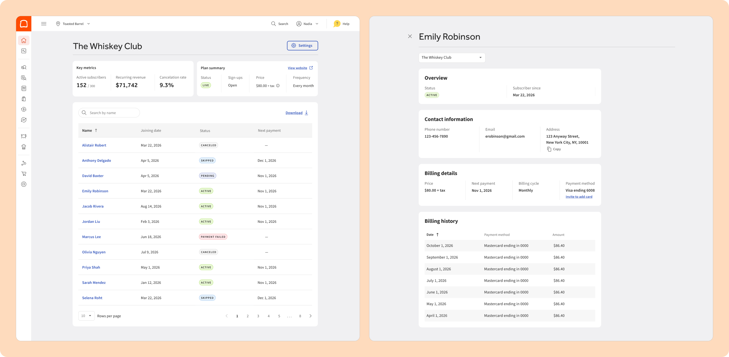
3. Operators track every subscriber from one dashboard.
A dashboard shows key metrics and every subscriber’s status at a glance. Operators can open any subscriber to see their billing details and history, or invite them to add a new card.
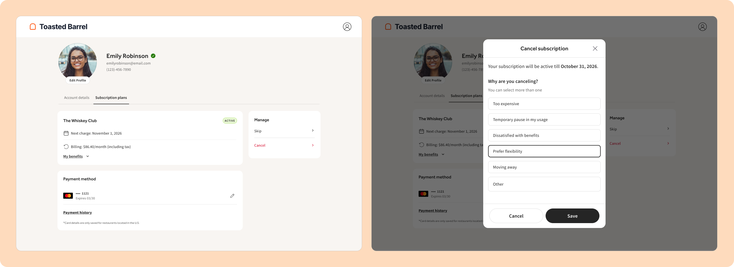
4. Guests skip, cancel or update their card on their own.
Guests see their next charge, benefits, and payment method in one place. They can skip a month or cancel. When they cancel, they’re asked why so operators know what to fix.
Decisions
Three calls that shaped the product
1. Retrying failed payments
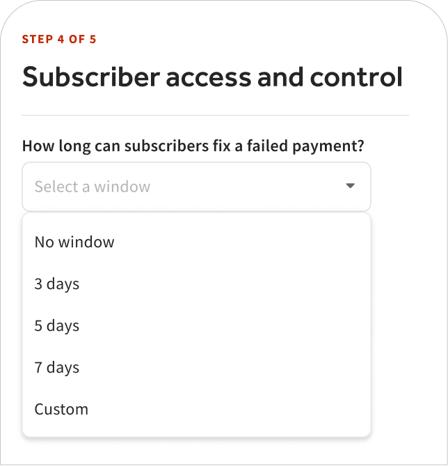
The call: Operators choose a grace window, from none to custom, to retry a failed payment before canceling.
Why: A failed payment is usually an expired card, not a member leaving. Giving them time to update it keeps them subscribed.
What we gave up: A few unpaid perks slip through. Losing a member over an expired card costs more.
2. Identifying members first
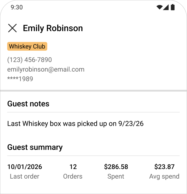
The call: Show members on the POS at the front of house before automatic discounts. We only had room to build one.
Why: Staff need to know who’s a member before any benefit can apply.
What we gave up: Staff applied perks by hand. After launch, automatic discounts quickly became a top request.
3. Keeping brands in one place
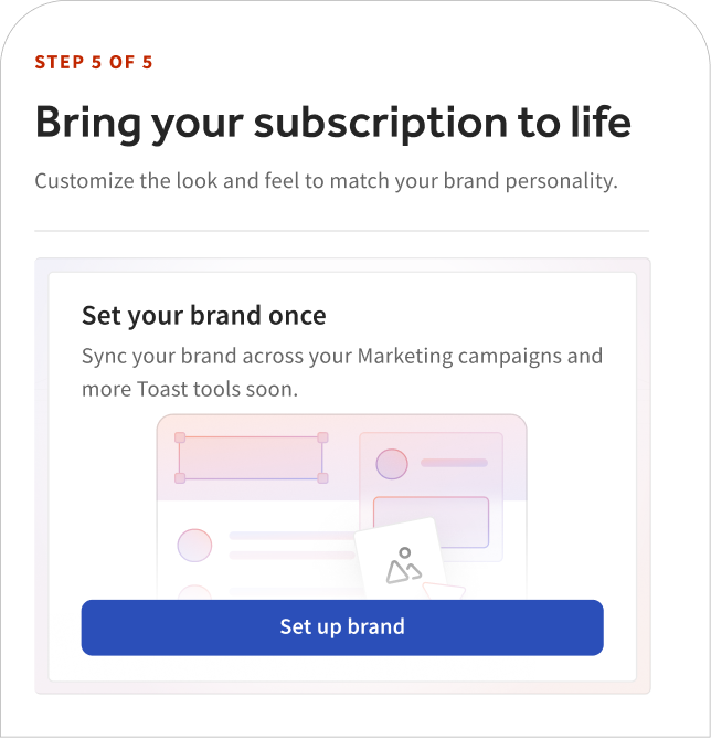
The call: I pushed to use Brand Hub for logos, fonts and colors instead of separate styling.
Why: An operator’s brand shouldn’t live in several places across Toast.
What we gave up: Operators had to leave the setup, add their brand in Brand Hub, and then return.
After launch
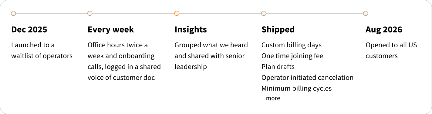
Launch was the start, not the finish.
Impact
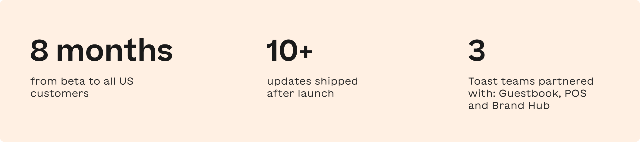
From a waitlist to live across the US
Reflection
What I'd take with me
1. Design for the pattern, not the plan.
Wine clubs, mug clubs and access clubs looked different, but they needed the same few building blocks. Finding those kept the product simple.
2. Ship the foundation, but plan the next step early.
Member identification had to come first. Customers soon asked for automatic discounts too, so next time I’d scope the follow-up sooner.
3. Design for where people actually use it
Subscriptions lived in Toast Web, but members show up at the front of house. Partnering with the POS and Guestbook teams made it real.